

Para tornar a iconografia de KINDA uma família, todos os ícones passaram a ter
a mesma espessura, mesma proporção e sem cantos arredondados.
Além disso, passaram a ter todos um pormenor que os identifica, um ângulo que retirámos
do logótipo. Bem como as linhas horizontais e verticais bem presentes no logótipo KINDA.
a mesma espessura, mesma proporção e sem cantos arredondados.
Além disso, passaram a ter todos um pormenor que os identifica, um ângulo que retirámos
do logótipo. Bem como as linhas horizontais e verticais bem presentes no logótipo KINDA.
--
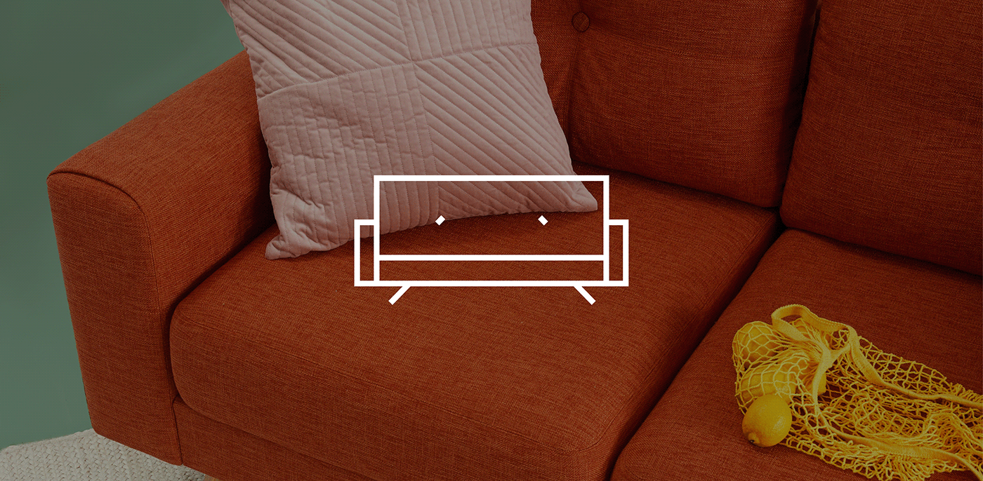
To make KINDA's iconography a family, all icons started to have
the same thickness, the same proportion and without rounded corners.
In addition, they now have a detail that identifies them, an angle that we removed
of the logo, as well as the horizontal and vertical lines present in the KINDA logo.
the same thickness, the same proportion and without rounded corners.
In addition, they now have a detail that identifies them, an angle that we removed
of the logo, as well as the horizontal and vertical lines present in the KINDA logo.

Creative Director: João Pina
Designer: Inês Freitas
Agency: NOSSA
Designer: Inês Freitas
Agency: NOSSA


